Vanasta
Sustainable Packaging
Redefining packaging through innovation, sustainability, and thoughtful design. Built for brands that care about quality today and the planet tomorrow.
Brand
Symbolization
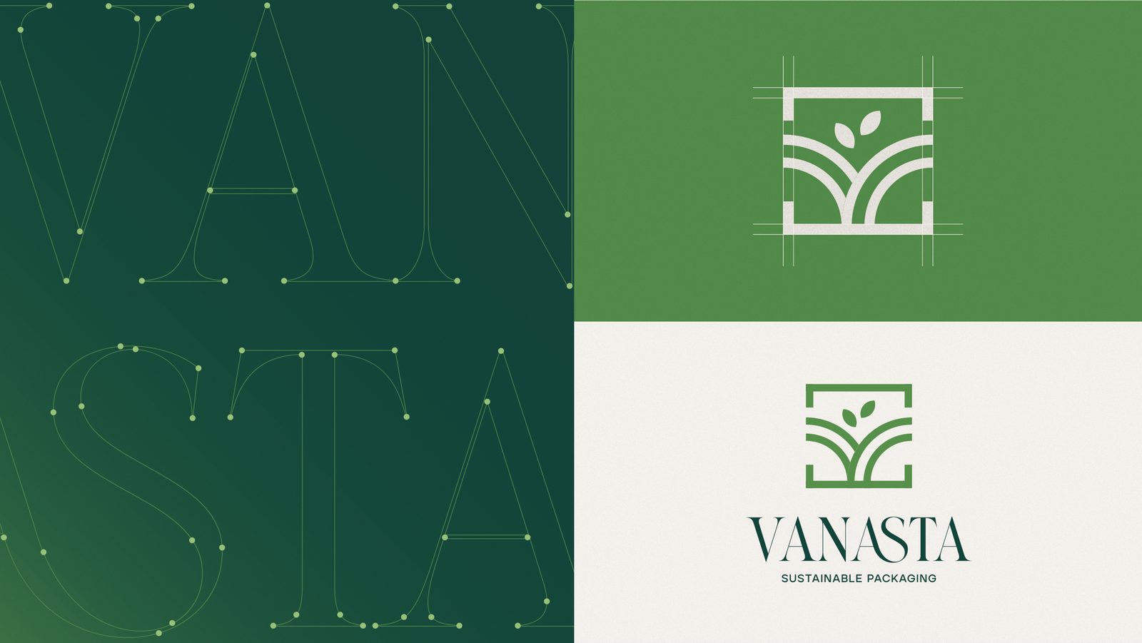
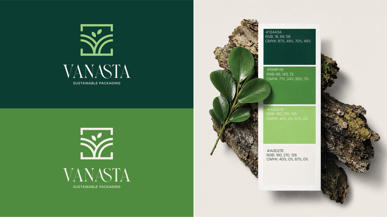
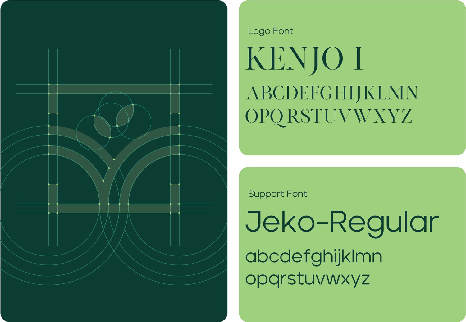
The Vanasta identity represents sustainability, growth, and responsible innovation. Inspired by nature, the logo reflects harmony between modern packaging solutions and environmental consciousness. Its clean structure and organic forms communicate trust, quality, and a commitment to a greener future.
Digital
Presence
We designed a modern digital experience that showcases Vanasta's sustainable packaging solutions with clarity and purpose. The website highlights the brand's products, values, and eco-friendly vision through an intuitive user experience that builds credibility and simplifies customer engagement.


Custom
Imagery
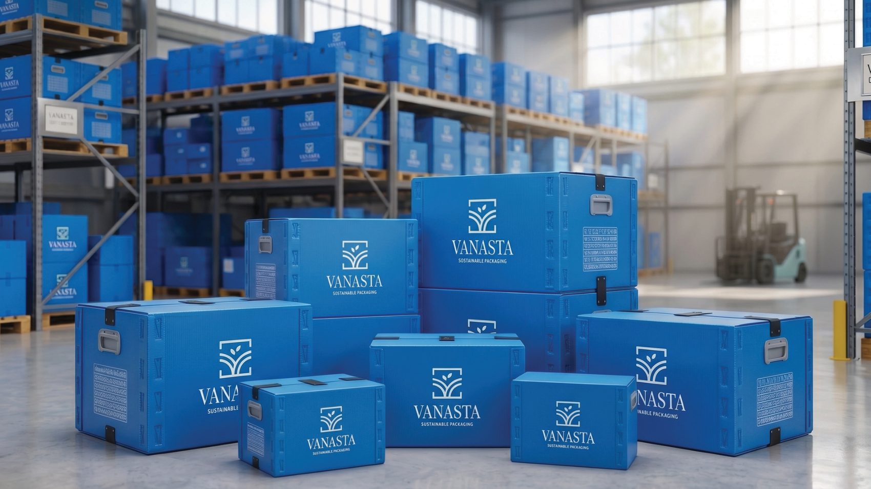
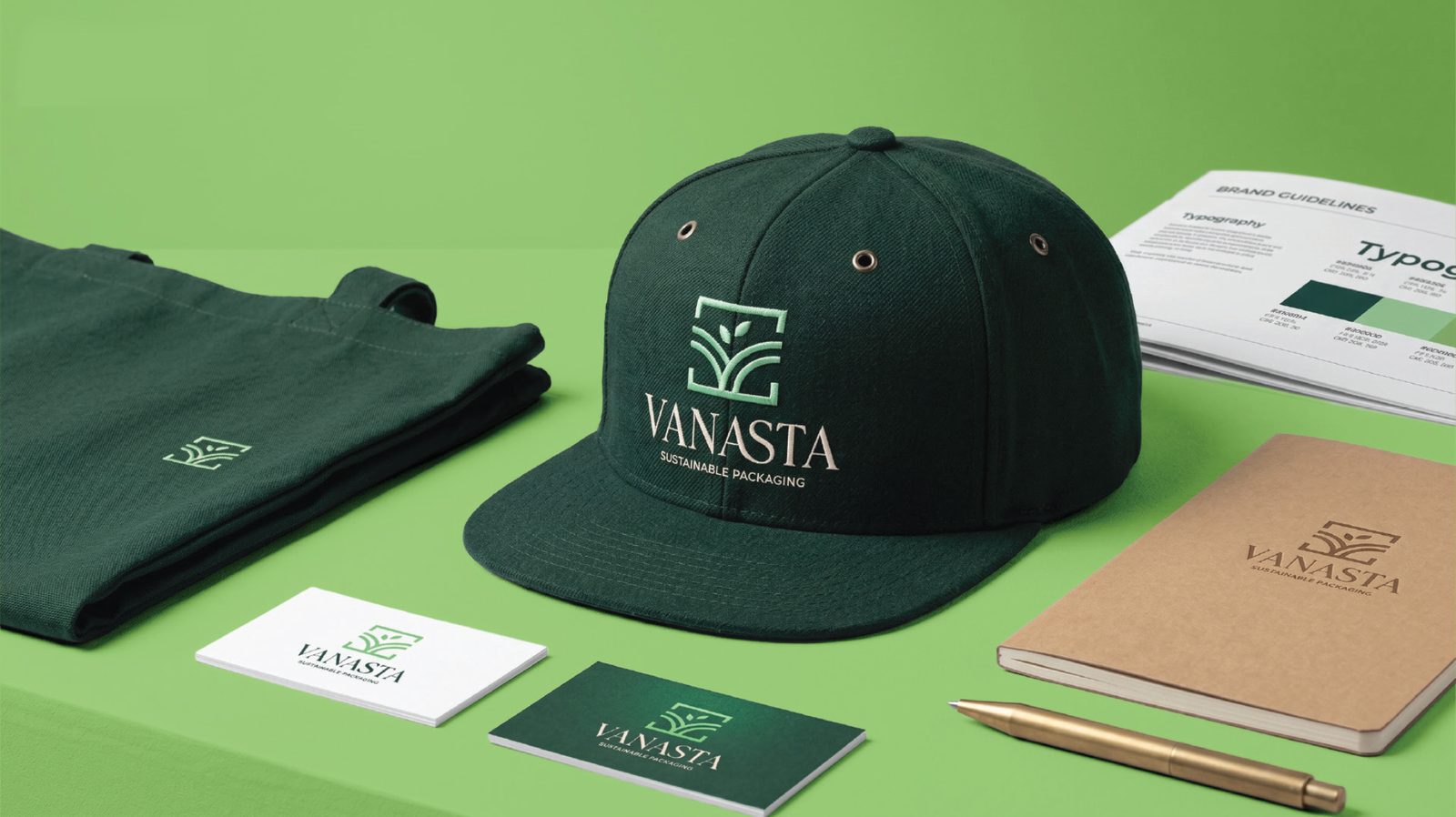
A cohesive visual identity was developed using nature-inspired imagery, sustainable materials, and premium product photography. Every visual element reinforces Vanasta's commitment to environmentally responsible packaging while creating a strong and memorable brand presence.

Sustainable
Packaging
Redefining packaging through innovation, sustainability, and thoughtful design. Built for brands that care about quality today and the planet tomorrow.