Skills Panacea
Personal Brand Design for Leadership & Communication Coach
Snehal Malpani
Brand
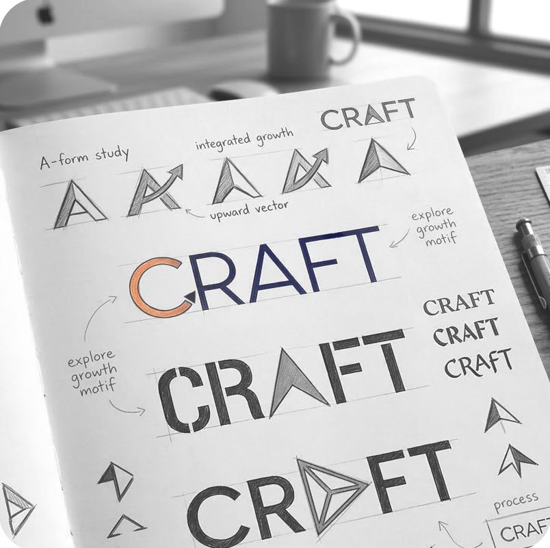
Symbolization
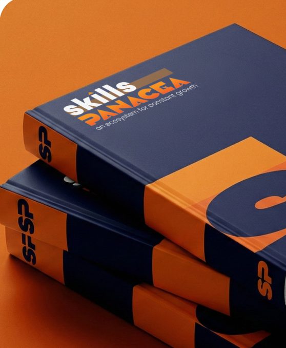
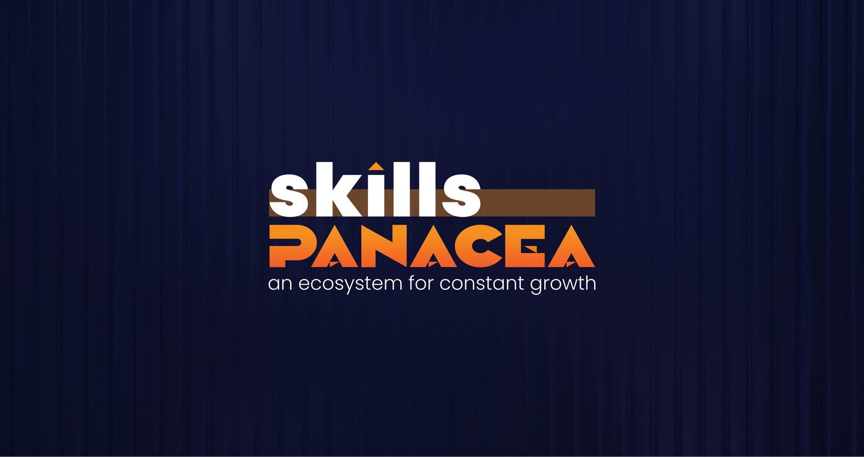
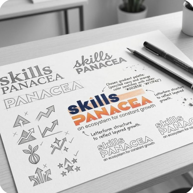
The identity is built on the idea that leadership is not inherited, it is developed.The logo reflects:Clarity in thinking and communication
Structured growth through intentional learning
Forward momentum in professional evolution
The upward accent signifies continuous progress.
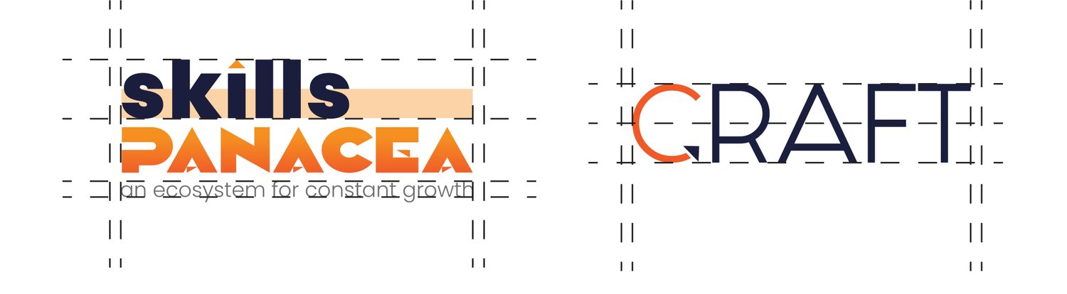
The bold typography conveys confidence and authority.
The grounded base represents a stable ecosystem designed for long-term leadership development.
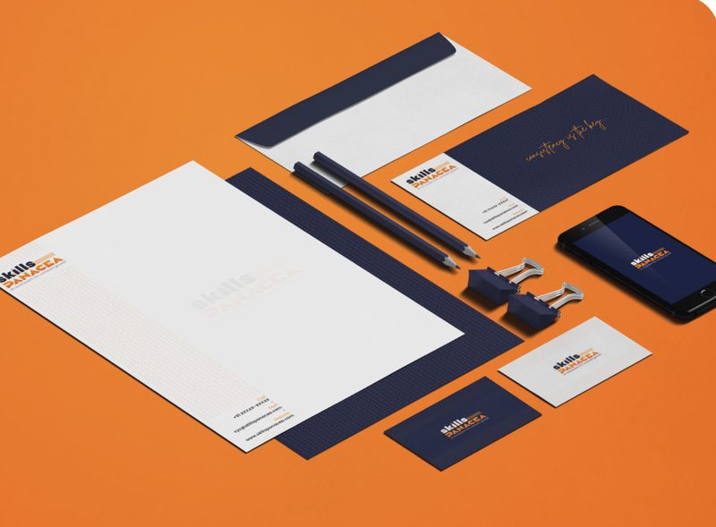
Blue
RGB: 26, 31, 62
CMYK: 94%, 88%, 45%, 52%
Orange
RGB: 245, 145, 32
CMYK: 1%, 51%, 99%, 0%
Red
RGB: 240, 90, 40
CMYK: 0%, 80%, 95%, 0%
Orange
RGB: 253, 145, 50
CMYK: 0%, 52%, 89%, 0%
Red
RGB: 245, 145, 32
CMYK: 1%, 51%, 99%, 0%

Digital
Presence
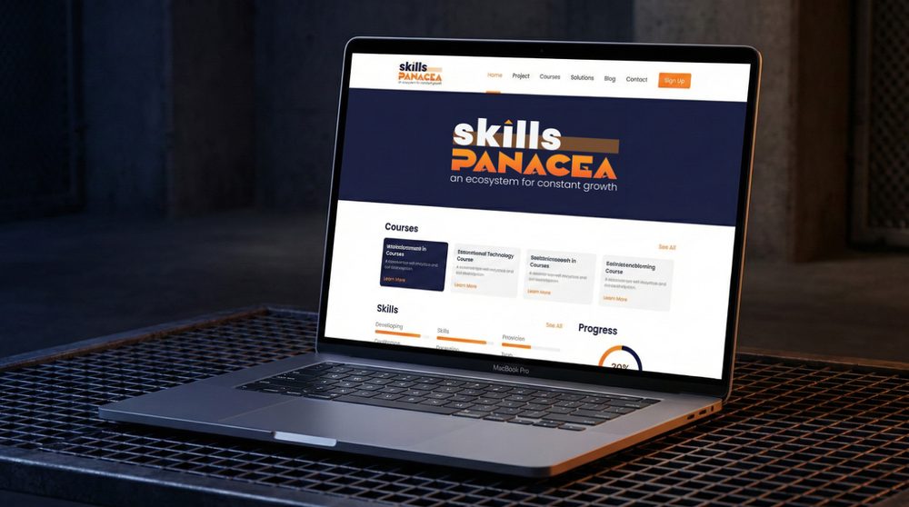
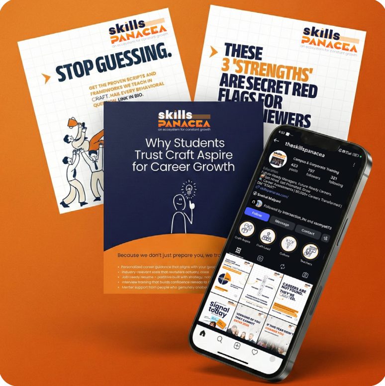
A digital identity that speaks before the individual does.We Created:A website experience aligned with executive positioning
Visual systems that communicate credibility, clarity, and influence
A consistent digital language that strengthens perception across platformsThis is not just visibility.
It’s strategic presence.

Custom
Imagery
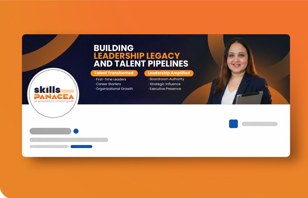
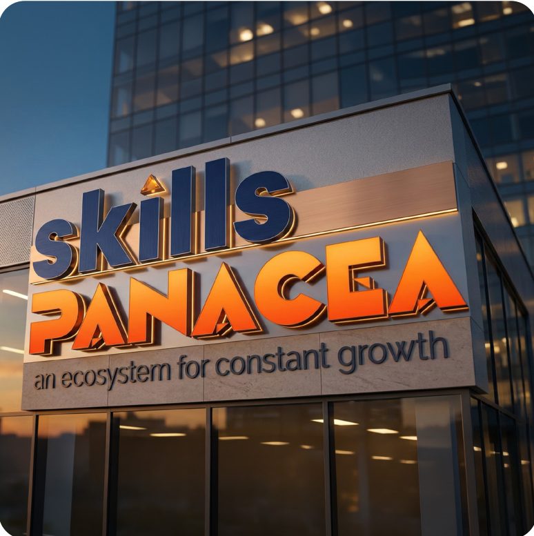
Every visual is designed to reinforce authority and transformation.We developed imagery that:Aligns with leadership, growth, and professional excellence
Reflects the journey from potential → performance → presence
Builds a strong and consistent personal brand ecosystemNot just aesthetics.
A visual extension of leadership itself.